Thursday, 12 January 2012

EVALUATION QUESTION ONE


1)   In what ways does your media product use, develop or challenge forms and conventions of real media products?

For our media product we decided to use the song “Sticks ‘n’ Stones” by Jamie T, creating a music video to the song, a magazine advert to promote the album, and a Digipak. When researching other alike artist’s products we saw what was comparable and what wasn’t and developed our media product accordingly.
When researching the music videos many of them had lip syncing throughout the song, we decided that we would include this in our video, to use the conventions that are used throughout Jamie’s video. Another convention about the official music video for ‘Sticks ‘n’ Stones’ is that it doesn’t have a real story line that is easy to follow, he just presents the song in an urban setting. 
We decided to challenge this convention by only including urban surroundings at the beginning and end of the song, and explore different areas to see how it would come out. We also had a solid story line in which the audience are able to follow. We developed the urban convention that the types of people involved in this genre of music are quite rebellious as it is shown in Jamie’s video.
We had our actor playing the part of Jamie, spraying graffiti onto the wall, this showing the rebellion within.
When looking into Digipaks and magazine adverts made for Jamie T we saw that the colours he used were very bright and bold, which reflected his style of music. The writing style on the adverts is very minimalistic, we decided to develop this convention by adding quotes from DJ’s and ratings from different music magazines, adding more variety to the advert making it more interesting for the audience to read. 
The images we used on the Digipak are carried through and used on the advert, by doing this the audience are familiar with the images already used on the advert so they don’t have to search for the Album when wanting to purchase it as they will already know what it looks like.
The album cover for Jamie T’s “Kings and Queen’s” album it very dynamic and bold, which reflected his style of music, similar to his Advert. The images used focus on Jamie only, we used this convention as we thought it was important to get the message across of who the Album was made by. We developed the font and writing convention as we wanted something that was easy to read. Jamie T’s album had writing going around the image, which looked effective but it was not the first thing you see, which is important when wanting to buy an Album as you need to know who the album is by, and what the Album is.
When researching and looking at Digipaks we were only in access of the front cover to most Digipaks as the full thing was never put online. 
We were not able to develop any of the conventions as we had nothing to develop from, so instead we created something in the Style of Jamie T with graffiti backgrounds and writing, which went with what we had researched and it fitted in with our video.
As our video was based around a chase we decided to include the actor which played the older man in our Digipak. We changed this convention from Jamie T’s as he only had himself and an unknown man located on his Digipak. 
It is not something that is normally considered in a Digipak, to include a character from a music video but we thought that this looked effective and it fitted in with our chosen music genre.

EVALUATION QUESTION TWO

 Here you can see that the Photograph used for the advert is the same photograph used on the Digipak, we did this so the product was recognisable for the audience


How effective is the combination of the main product and ancillary texts?

The three products relate to each other in many ways. One of these being the theme of rebellion throughout all three products. Rebellion is represented through the clothes that our actor playing Jamie wears,  the attitude he has in the video, for example the spraying of graffiti on the wall, the pulling of the metal fence and the breaking through someone’s house, and the language used in the music.
We decided that the graffiti used in the music video would be used in our Digipak and Advert, by doing this it created something that the audience would remember and recognize when seeing any of the 3 products alone.
When deciding on what images to use on our digipak and advert we concluded that using the same images on both would be the best idea. Having the same images on the advert and digipak would create a product that was easy for the audience to remember.
Using photoshop for both the Advert and the Digipak connected them together in a way that the effects and techniques used to edit with would be the same. Using two different editing programmes could have created a product that looked unprofessional and untidy. So by using photoshop  we finished with 2 professional looking products which linked together.

EVALUATION QUESTION THREE

What have you learnt from your audience feedback?


When creating any product that is for the public one of the most important things you need is feedback and advice from the audience. Here I have shown three examples of feedback I got from posting my video on Facebook and Youtube. Before we created our products we created a survey on surveymonkey.com to find out what elements the audience like best about music video. Our results showed that bright colours and a strong story line were the things people liked the most so we developed our video accordingly. After creating our video we posted it onto youtube for it to be accessible to the public. After having the video posted for just over a month the views were showing almost 1,000. Although there was a high amount of views on our video we didn't receive much feedback which would have been useful for us to improve on any area's the audience thought weren't as good as others if we were to do it again. After posting it on Youtube, each one of us posted it onto our facebook accounts, so it could be seen by friends and family, and specifically asked for comments to be posted as we did not do this on youtube and had no feedback to work with. After researching what the audience liked in videos before we created our final product we found that a strong story line was something that made them want to watch the video. When collecting our feedback from the finished video, the thing people seemed to like the most was the story line. Before the video was posted onto the internet we showed our class mates who all enjoyed it and complemented us on how good the editing and synchronization was. Finally we showed our finished video to our Family members, who we able to comment straight away and tell us what they liked and didn't like. As we were given no constructive criticism there is nothing I am able to say about what we would improve if we were to remake this video.

EVALUATION QUESTION FOUR

How did you use media technologies in the construction and research, planning and evaluation stages?
The technologies we used are listed below
Software

Adobe Photoshop -
Adobe Premiere -
iTunes - 
Microsoft word -


Hardware

Computer, 
Laptop, 
Memory Stick,
iPod, Mobile 
Phone (contact during filming) 
Canon DSLR camera


Websites

www.blogger.com, 
www.youtube.com ,
www.facebook.com, 
www.twitter.com, 
www.wikipedia.org, 
www.gooogle.co.uk, 
www.google.co.uk/images, 
www.dafont.com, 
www.surveymonkey.com


During our research the websites we used the most were www.youtube.com and www.surveymonkey.com we also used google images during this process to collect images of Digipaks and Adverts by Jamie T and similar artists in the same genre of music. By doing this we were able to adapt our work to how they are portrayed on existing products. 

Thursday, 10 November 2011

Account of Filming

 Day 1:
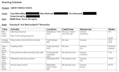
Our first day of filming went to plan apart from a few difficulties. We filmed in the underpass close to York College, as the setting for this was perfect for our Urban style video. We added a few extra shots in this area as we were experimenting with what looked good and swapped some shots around to create a better finished product.
We then went on to film in the city of York. We had originally planned to film inside “Fantasy World” a fancy dress shop in Fulford, York, but we were denied access to this area and had to use a plan we had thought of as a back up, which was the chase along side the river, and the scene on the “York City Walls” As we had this as a backup plan we had involved another actor which was not listed as we presumed we would not have to use it.
Day 2:
 On our second day of filming we were in Wheldrake, York. We arrived at Chris’s house at 11 O’clock and started filming right away. We stuck to our plan on this day as we encountered no problems throughout the day. The first few shots were shot outside of Chris’s house, there were no problems here as the road we filmed on was quite so we weren’t disrupted by lots of traffic and members of the public.
In the second part of the day we were down a country lane and in a forest, we had no problems here although we added scene filmed out of the back of a car, as we had the resources and we all decided it looked good.

Storyboards & Planning


Friday, 30 September 2011

Audience Research

Quantitative: Research Via surveymonkey.com - Building an audience profile of their tastes, activities etc.

Link to Survey:
http://www.surveymonkey.com/s/37SWQCY
(White bar to hide offensive comments.)


Qualitative:
Interviews with 2 target audience members. 4-5 questions, with main focus on what they enjoy in a music video, what appeals to them in album art and what they like particularly about a genre.


Questions:
-How would you describe your style of clothing?
-What type of music Genre do you like, and did this influence your style?
-What appeals to you most about your favourite genre? (the look, sound, etc)
-Are there any activities you enjoy doing?
-What kind of imagery do you imagine when listening to your favourite music?
-What do you expect to see in a music video from your favourite band? (Besides the band playing)

Advert Analysis - Conor

Magazine Advert Analysis

For my part of the magazine analysis, I will be taking a look at this advert for a Pendulum Album.
The colour layout of the poster has a nice neon yellow onto black. If the ad simply had just a black background with a symbolm, they would assume that this looks more like a heavy metal band, due to the conventions of having a dull black background. However, with added use of neon, and the picture of an alien planet in the back of the symbol, we now know that this band is more in the drum and bass scene. The reason why neon sparks this idea goes back to the use of neon colours in clubs and raves. Because of this, we asociate that neon colours are a convention of drum and bass/techno songs. But since Pendulum falls under the Cateagory of "Drum&Bass/Metal" it also has elements of a metal look to it. An example of this would be what I said near the beginning; the dark colours and black give this a metal feel, but the added use of neon lighting shows the element of drum and bass. The look of the symbol and colours is also similar to the Pendulum albums themselves, so long fans of the band will be instantly farmiliar with the poster and band.

Other than this, the advert contains basic information, such as: Band Name, Release date, tour date, tour information and aditional info, such as sponsors etc. Below the band name, there is also a sub-title describing just what it is advertising in a breif sentence. 


Thursday, 29 September 2011

Digipak Analysis


Photography: The photograph on this digipak is a posed picture of the band U2. The expressions on their faces are serious making them look professional. I can suggest that their music might be aiming at an older audience than Jamie T from this photograph. However the band are wearing 'cool' open collared jackets. This means the band have a 'rocky', 'cool' sound and therefor their audience may also be 'cool' and into rock music. The band are also staring into to lens of the camera, this makes the digipak feel more personal and involve the consumer more. This means their fans feel more involved and that's what want from a band. 

Colour Scheme: The colour scheme for this digpak is minimal. The only thing that has any noticeable colour is the photograph. This makes the digipak easy on the eye as too many colours can be garish. The background of the digipak is almost on faded/worn paper which gives the whole thing a vintage/'cool' look. This style emphasizes the 'coolness' the band exude and what the fans aim to be.
 
Fonts: There is hardly any text on this apart from the small part at the bottom and the bands name 'U2' and their album name 'OCTOBER'. These titles are in block capitals and have a pretty simple font. Again this no fuss style is part of the bands persona. It makes the digipak more about the music than about aesthetics. The font itself has slight rounded edged lettering. This style makes the title look sophisticated which relates to the bands age.  

Layout: The layout is also pretty simple and not fussy. The main image is large and slightly off centre. This gives room for the small amount of text but also gives the digipak a slight edge to it. Although the layout is simple it mixes it up a bit which can reflect the bands 'cool', 'edgy' sound.

Tuesday, 27 September 2011

Magazine Advert Analysis - Conor

"Bat For Lashes"


She is treated more of an inde/folk genre, and this is shown well in the page. When we think of folk, we associate it with older music that is native to us, and so in this picture she is depicted as a native American, wearing things such as handmade clothes, a bandanna with a charm on it and has two horizontal lines, parallel to each other on her cheeks. The poster its self is also has a handmade feel, mainly to complement the folk feeling of how everything they created, including the clothes on their backs were made by hand. Even the font looks like it has been made of different materials. The colours however are not that bright, and have a washed out feeling to it, but this is due to the genre again, and mostly her song topics. Half of her songs aren't about the happy things in life, but more about dealing with the hard times. Other than this, the poster does not give much information, such as a release date and such, so it's missing a crucial part of what makes it an advertisement.

Digipak Research - Conor

This next band is more relective on my chosen band's genre- inde/punk/rock/garage. Considering I could not find any digipaks for "The King Blues" I thought it would be wise to inspect their normal album art instead, to give me a rough idea on how the digipak will be designed.


The genre of punk/inde has been known to be more of a rebelious type of music. This is shown in the album art as soon as you look at it. The band has been placed infront of a bilboard with grafitii on it. Now, grafitii is already the sign of expression on the true world and going agaisnt the rules, but this is a different kind of grafitii. Since the band is more focused on the rebelling agasint the government, it is exicuted in the form of a letter to Gordan Brown. Agruing with the choices that he has made when he was in 'control'. Not only this, but the song this album is based on, has some of the words that have been written on the bill-board. The font of the words "The King Blues" also appear to look like an old army font, but slightly modified, maybe to symbolize that this group works for us like an army. More on that soon.

The colour choice for the album isn't bright, but it is also not very dark and gloomy with gothic imagry like the pervious digipak had, because of the band's genre. But it is also not brightly coloured because the colours must reflect of the subject of which the band is singing about. In this case, it is about a Broken England where the Middle to lower class of people live harder lives filled with tax and sons going out to war. Where as the higher class don't need to worry about such things. "The Rich get richer and the Poor get poorer." Because of this, the album cover is shot on location of a London street. The colours are dark and bland, reflecting on the situation the band's country is in. They are also wearing every-day clothes you see many people wear around busy streets such as York, so it also shows us that these people represent the every-man. But in this case, they are speaking up for those who are too afraid to. The album art is a voice of opinion.

Friday, 23 September 2011

Album Magazine Advert - Jamie T

Band: Jamie T
Album: Kings and Queens
Genre: Indie/Punk


Photography: Similar to Jamie T's "Kings and Queens" album cover the image here is taken from below. They are surrounded by metal fencing which could be seen as a stair case, which i thought it was when i was looked at this for the first time. Having the railings go all the way around the photograph makes the audience watch where they go, also making the audience see everything in that image.

Colour Scheme: The colour scheme for this advert is very dull, and not exciting. I think this looks quite effective as very bright colours can be a bit off putting when you're trying to read information. The black and white picture contrasts with the yellow and red above, this makes both elements easy to look and and read.

Fonts: This magazine advert has used very basic and minimalistic fonts, as the main focus is on the picture, the same as any advertisement the first thing you look at is the image, you then go on to read the writing. The font is large and bold which will catch the readers eye.

Layout: The rip between the image and the writing section creates a sense of two separate adverts stuck together. This could reflect on his music as most of it is set in urbanized locations in which are not perfect and some things could be torn apart such as family's or friends. 

Digipak Analysis - Jamie T

Band: Jamie T
Album: Kings & Queens
Genre: Indie/Punk

Photography: The image you see straight away is of Jamie jumping in the air, the photograph is taken from below him so you get a full perspective of him and his surroundings. In contrast to the other man standing in the photograph you are able to tell which is Jamie as he is in the center of the picture. The buildings around him are very urbanized which relate to his videos and style of music. The other man stood in the image is upside down, and looking into the distance, this shows he is less important to the album.

Colour Scheme: The colours in this album colour are very bright and vibrant, they have a sense of energy to them, the music in this album is very fast pace, so they colours relate to the music. Having Jamie and the other man dressed in black make them stand out from the bright colours, as they are what wants to be center of attention. Having different colours for the each of the "Jamie T" and "Kings and Queens" adds lots of variety to the album cover, it makes you read all of them.
Fonts: The fonts on the album cover are very basic and are in total contrast to the photography and colours, having the fonts go all the way around the picture in a circle instantly makes them more interesting to look at. If the fonts were in a different style to this, maybe in a fancier font it would be alot harder to read them going round in a circle.
Layout: Having a basic layout style on an album cover can look very effective if it is created in the right way, on this album cover this is exactly what they have done. There are not tons of things for the audience to look at, they have 1 image to foucus on and some text going around the side. There are many things to notice inside the circle in which the image is situated, such as the buildings around Jamie, the other man stood upside down, showing his less importance, the colours are another thing to notice. Having this on a black background makes the audeince focus in on this first. They then notice the writing around the edge which is laid out in a style which goes all the way round the image, this makes the reader tilt their head slightly to read all the writing, doing this also makes you see the picture from different angles.

Video Analysis - Alice

BAND: THE KING BLUES
SONG: SAVE THE WORLD GET THE GIRL
GENRE: INDIE/PUNK
http://www.youtube.com/watch?v=rs8ZSlJO34Q

Locations: Throughout the whole music video the locations are in urban settings. For example in car parks, alley ways, housing estates and garages. The second set of locations in this music video are live venues. Actual footage from the bands performances. For example, festival stages/intimate stages. The locations match the fan base of the band as they are most likely to be from working class urban lifestyles.

Costumes: The band have rough/indie style music. This is reflected in their clothing with worn out hats, vintage T-shirts and skinny fit jeans/trousers. Their clothes are casual and worn. Again their fan base would relate to this as the band aren’t trying to be something their not.
Story line: The video starts with the band loading their van to presumably go to their next venue. This is shown though snippets of stop motion throughout the video. It shows a toy van on its path across a map. The band get to their venue, unload, setup and play. There are lots of shots from previous performances at festivals and inside gigs. This type of story line containing clips from gigs works well as the initial narrative is easy to follow and doesn’t take or away from the music or get lost in it. It compliments the music genre well.
Performance: The band don’t perform especially for this video as all the shots of the performances are from lots of different previous gigs. This gives the fans a chance to get to see the band perform live. Seeing bands live is a big part of an indie/punk rock following.
Style & Colour: The style of this video overall has a vintage, laid back feel. For example, a sepia tint on screen in certain shots. This reflects the bands laid back attitude towards style. Vintage and washed out colours are a convention of the indie genre and so are frequently used in this music video. The stop motion element of the video gives a fun, childlike quality and reiterates their laid back, fun attitude. The audience can relate to this as it’s not threatening or brash.

Tuesday, 20 September 2011

Video Analysis - Conor

In this post I will be analysing 3 music videos with my asigned group. Firstly I will post up what I found in the first video I went over and then the remaining 2 my team mates looked over. We all have agreed that our chosen genre is a rock/inde style of music, so the video I will be looking over is:


 Two Door Cinema Club - I can talk:


Location: It's location is not specific, but in the video it briefly shows hints that the music video is taking place in a (were)house of some sort, with many materials and clothes drapped around the walls and thrown on the floor.

Costumes: The costumes change all the time, but they are very consistantly bright and colourful ( jeans, jackets, t-shirts polo shirts etc) to match the enviroment in which the band is in, and even the music they are playing. For a feel good song like this, the colour needs to reflect on the band's personality as a band, and these colours fit the music and feel well.

StoryLine: As far as the story line of the music video goes, there is non, and do not follow the lyrics of the song. The video is given in an old film like style, starting off the video as a film would start- ie: with credits and the title of the film. In this case, it is the title of the song. Credits are also given in the end, so it is shown as a short experimental film. It seems to be going for a "swinging 60's" style, where film making was more independent experimental and free. The use of some clothes also seem to of been around from that era.

Performance: The perfromance is fast paced and interesting to hold audience attention. Characters never stop moving or walking forward at any point in the video. This was made to keep up the flow of the video and give it more rhythem. Strobe light effects are used during the chorus as well as the bizzare imagry that makes this video. Fabric moves with the beat as the characters play around it. The colours dancing with them as the music does. This is purely for synchronization, linking the colours and music together. Fabrics even become apart of the band at some points, also establishing a link. Other than this, we have images of the band giving us illiusions such as the lead singer having his head removed to reviel another one.

Style and Colour: The style of the video is a brightly coloured; as I previously said, this was used to asociate the feeling to the band. The vibe is a feel good cheery song, so the use of many colourful clothes all around the house helps to reflect this music and it's genre. It would be unusual to hear this music in a black and white video, because the life that was in the music would of been drained slightly by the imagery.

Extra Notes: The constant movement and strobe effects in the video is something we plan to use in our music video, which will be based on a Chase scene, so movement will be key. It will give our song more fluidity and the added stobe will give excitment during the chorus. However, we will plan to add more to the video to keep it more interesting.

Video Analysis - Faye

Band - Bombay Bicycle Club   
Song - Dust on the ground
Genre - Indie


http://www.youtube.com/watch?v=XPgetSbJ8II
The location of this video to start with is in a woods, they then progress to the grounds of a large house, the final location is inside the house, where many of the rooms are shown.
The costumes for this video are very casual, for the band members, the girls wear white dresses which is a contrast of their personality which is later shown in the video. The dresses are quite old fashioned and plain, which in someways relates to the style of the song, as it is quite slow.
The story line of this video shows the band members watching a group of girls, the girls look sweet and innocent in the beginning, but this look is later changed as you see one of them with a gun behind their back. Another thing which changes their innocent look is the fact one of the girls wipes blood of another girl’s knee, she then proceeds to put this blood on her lips as a lipstick. The band members see this and escape from the house as fast as they can.
There is no live performance from the band, they do appear in the video, the lead singer sings in the video, although, not every time the camera is focused on him.
The style of the video is quite an old fashioned, washed out approach. The washed out colours make the video seem alot older than it is. At random points in the video there are bright lights which give the video a fairty tale "Alice in Wonderland" feel to it.
The colour in the video up until 0:45 the colours are constantly bright and vibrant, as it is the outdoors there is lots of green grass, green tree's and colourful flowers, after 0:45 the colours turn to be very boring, there is a contrast between the girl's white dresses and the boring, cold colours of the inside of the house. 

Friday, 9 September 2011

What is a Digipak?

A Digipak is a specially made style of packaging. A plastic tray that holds the CD or DVD known as a "flexi-tray", this is glued to a preprinted and finished board.
They can be designed to meet different requirements and hold any number of discs, with the most common type of Digipak being a four printed pagemversion holding a single disc.
When products consist of multiple discs a slip case is often used to complete the whole "look" of the finished item.
Digipaks are used in a wide variety in the retail market, particularly for limited edition gift sets, such as long running television series.


Statment of Intent

I am Faye Morrallee, I am doing my A2 Media coursework, which will include making a music video, digipak and an advert for a magazine. These will be made in groups. Last year's courework icluded me making a Music Magazine, this involved making a front cover, contents and a double page spread. I did this individually. I hope to achieve many things from this years coursework, such as, developing my skills in video editing and filming.
I also hope to learn more about differnt shots and camera angles, and what looks professional and effective to fit in with the genre of the music video. I am also hoping to learn how to work well and efficiently in a group of people.
After I have finished the project I hope to have learnt and developed many new skills. One of these being my understandment and knowledge of the music video industry. I also hope to gain confidence as this is something I lack. Managing a project like this and putting my ideas forward will help me be more confident and stop me being afraid of what people may think of my ideas, as if they are never spoken, no-one will ever know what i had to say. I also hope to gain more knowledge in Photoshop, as this will be my main source for creating a Digipak and Advert. Although I used Photoshop last year on my AS project I feel that there is still alot more i could learn, such as different editing skills etc...